
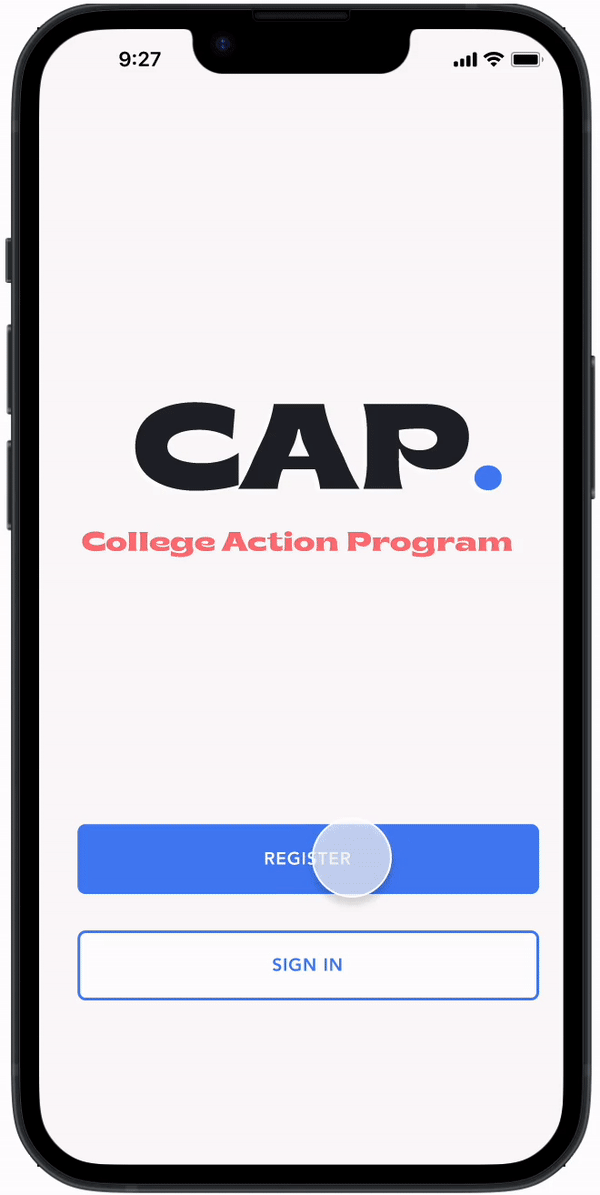
Seamless College Transition App
for First-Gen Students
APP DESIGN
College Action Program aims to eliminate the "Summer melt" barrier for low-income and first-generation college-bound students. This phenomenon occurs when students lose interest over the summer, leading to enrollment gaps. The CAP app provides a solution by managing applications and deadlines and offering ongoing support for a smooth college transition.
OVERVIEW
Role
Research
Interaction
Visual design
Prototyping & Testing
Team
Kayla H. (UX Designer
Victoria A. (Ux Designer)
DURATION
1 Month
Tools
Canva
Figma
Maza
Asana
Slack

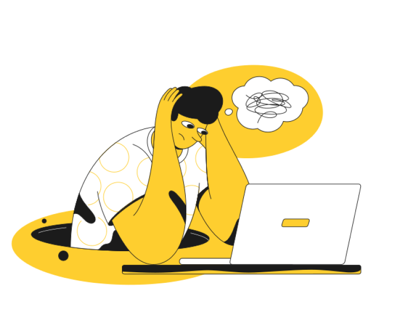
The Problem
Here’s a jarring fact: Between 10-40% of college-intending students never enroll. This phenomenon, known as summer melt, disproportionately impacts low-income and first-generation students. Without adequate support during the transition to college, many of these students lose their way.
I remember reading over 1 in 5 college-bound students fail to matriculate. Existing resources weren’t addressing this gap, and it was clear that we had an opportunity to make a difference.
The Challenge
Our research showed us that summer support programs can boost enrollment by 3-4 percentage points, we asked ourselves:
How can we design a tool that not only empowers students but becomes their compass during this critical life transitioning?
This question set the foundation for our design journey.
Here’s a Little Design Highlight
View the arrows on the side to scroll through the designs
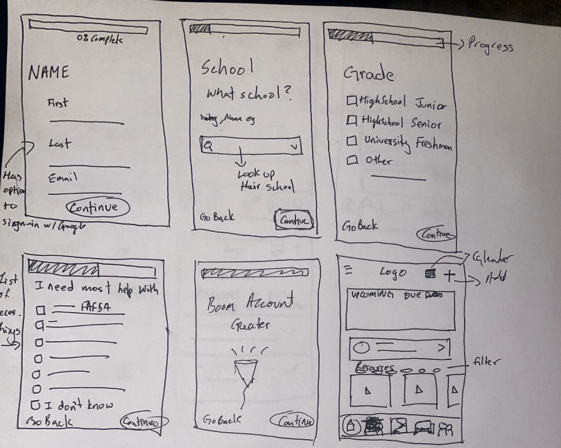
A Personalized Onboarding Approach
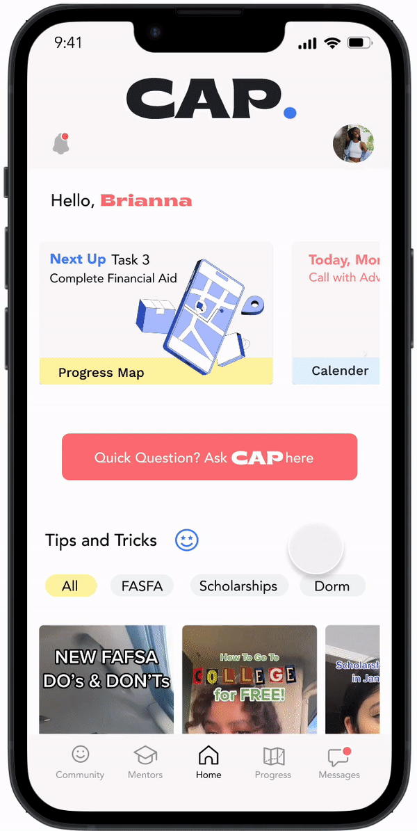
Built-In Support
Tasks & Reminders On-the-Go
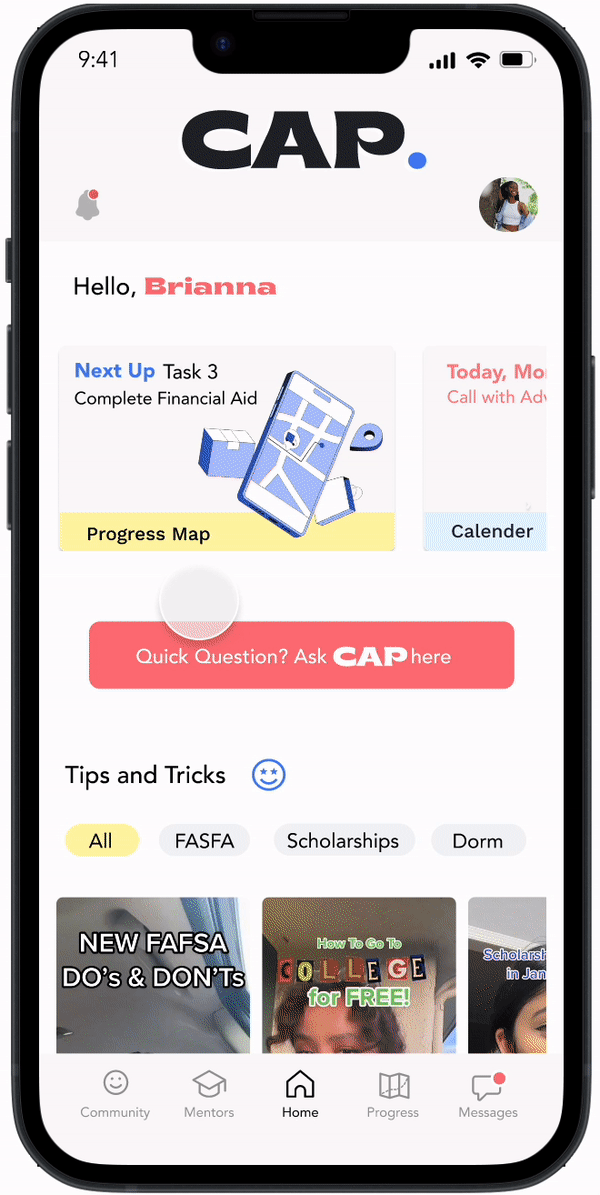
A Gamified Task Tracker
The journey
Understanding the Problem
Market Analysis
We began by doing some comparative and competitive analysis. While many tools help students get into college, we found a surprising void when it came to supporting their actual transition. This insight became our rallying cry to innovate.

Talking to the Students
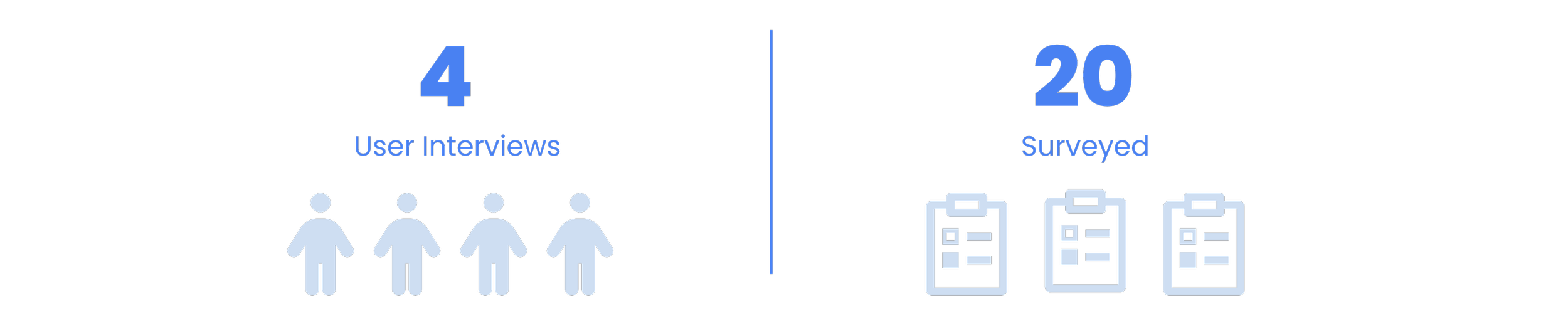
We knew statistics weren’t enough; we needed to hear the students’ stories. We conducted in-depth interviews with 4 students and surveyed 20 more, all from low-income and first-generation backgrounds. Their experiences revealed an emotional rollercoaster of stress, confusion and frustration.

Here’s what we Learned
We synthesized our findings using an affinity map, and identified four major pain points:
-
Students felt abandoned after high school graduation.
-
Tasks like financial aid and registration were overwhelming.
-
Complex instructions added to their stress.
-
Many had to seek external help, often unreliable or incomplete
Designing the solution, the Mvp
With these insights, we set out to design the College Action Program (CAP) app, focusing on what students truly needed. Minimum Viable Product (MVP) included:
-
Students could choose the areas where they needed the most help..
-
Real-time guidance from mentors and advisors.
-
A visual map of tasks and deadlines, transforming stress into progress..
-
Notifications to keep students on track.
Design evolution at a glance
Based on feedback, we made refinements and revisions to the sketches, incorporating additional features and clarifying the user interface. This process of iteration and refinement continued until we arrived at a final set of sketches that accurately captured the company's vision and objectives while also providing an intuitive and engaging user experience. Throughout the process, we remained focused on the user, prioritizing simplicity, ease of use, and clear communication to ensure that the app would meet the needs of students.

We sketched, prototyped, tested, and iterated. I vividly remember the moment during user testing when a student said
“This feels like having a mentor in my pocket."
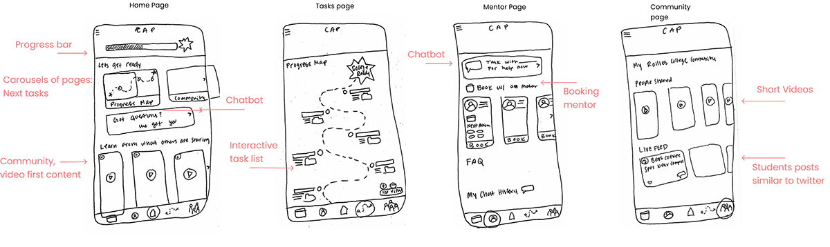
Iterative Design Process
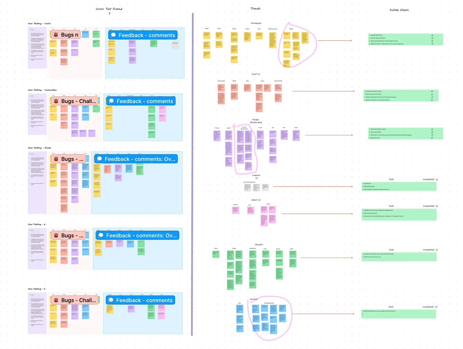
5 Key improvements
We didn't stop at wireframes! Usability testing, conducted through Maze, a user research platform, was crucial for refining the CAP app's design. Through multiple rounds of testing (we iterated and tested 3 more times), we identified and addressed user feedback, leading to the following 5 key improvements:

Clearer Navigation
Based on user feedback, we added labels to the navigation menu, making it easier for students to find the features they need. This resulted in a more intuitive user experience.
Enhanced Accessibility
User testing revealed the need for a more accessible chatbox. We addressed this by integrating the chatbot functionality on the home page and the "messages" and "mentor" pages, allowing students to access support throughout the app easily.
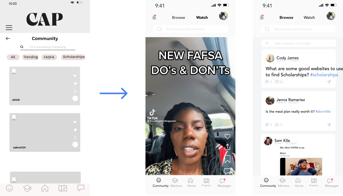
Community Page Redesign
User testing revealed a preference for video-first content. Based on this insight, we redesigned the community page to prioritize video content, similar to other platforms users are familiar with. Additionally, we separated video and text content, allowing for easier scanning and "like" functionality for instant gratification.

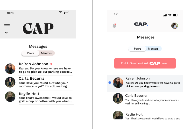
Improved User Profile Access
Previously, accessing the user profile was achieved through a hamburger icon. User testing uncovered low success rates and high misclick rates.

Engaging Progress Tracking
User testing highlighted the desire for a more engaging way to track progress. We implemented a circular progress bar, allowing students to visualize their application journey easily.
“I think the progress map is super cool! It’s a really good visual of what’s been done and what’s left to do.”— User
Final Design
Challenges and Compromises
-
Time Constraints:
With just one month, choices demanded precision. Prioritization became essential as we balanced depth with speed.
-
Team Dynamics:
We had differing opinions on visual styles. In the end, user feedback guided us to a consensus.
-
Brand Alignment:
User testing revealed conflicts between our UI design and the company’s branding. Resolving this required swift adjustments to maintain both usability and company branding.
The Impact
By the end of this sprint, we had created more than just a design- we had a tool with the potential to help these students succeed. Feedback from students was overwhelmingly positive, with many describing the app as intuitive and empowering. Lauren, the founder, was thrilled with the results and used our work to secure funding for the project’s next phase.
Update: Lauren successfully secured funding! The next step is launching a website to build traction and gauge interest. Check it out: College Action Program.
Lessons Learned
Collaboration Drives Innovation:
Diverse perspectives challenged us to think bigger and better.
Adaptability is Key
Tight timelines demanded quick pivots, and we rose to the challenge.
User-Centric Design Wins
Focusing on real user needs led to a solution that resonated deeply.